All digital marketing efforts, ads, content, SEO, social media, are ultimately designed to lead a user to one place: your website or one of your interactive channels. But more specifically, they all funnel down to a single destination that can make or break your campaign: the landing page.
This is where the real engagement begins. It’s the moment of truth, where a user either takes action or leaves. If your landing page is not well designed, all the energy, time, and money you’ve spent up to this point may go to waste.
That’s why I decided to share a few practical tips and walk you through the anatomy of a high performing landing page.
First and foremost, a landing page should be visually appealing and tailored to the specific product or service you’re offering.
Here are a few golden rules:
-
Clarity is king: Avoid cluttered or confusing information. Keep your message focused and easy to grasp.
-
Limit distractions: Try to reduce, or eliminate, external links or navigation menus that take the user away from the page.
-
Every element should guide the user toward a single action: clicking your CTA.
-
Use multiple CTAs throughout the page, positioned naturally to catch attention without overwhelming.
-
Keep the header and footer minimal, with only essential information.
-
Add a floating CTA button, ideally linked to WhatsApp or your live chat assistant, to make it easy for users to reach out at any time.
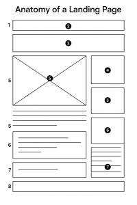
Below, I’ve included an illustration breaking down the key sections of a landing page, and I’ll walk you through each part in detail.

1. Header
A minimal, distraction-free space that typically includes branding (logo) and possibly a stripped-down navigation, if any at all.
2. Headline
This is the hook. A clear, compelling statement that grabs attention and makes visitors want to scroll down or take action immediately.
3. Hero Section
A large visual or background image paired with a short message or value proposition. It sets the tone and instantly communicates what you’re offering.
4. Call to Action (CTA) Button
A prominent button placed above the fold. This could say “Book Now”, “Get Started”, or “Claim Your Offer”. It drives the main action you want the user to take.
5. Body Copy + Supporting Visuals
This section includes persuasive and informative content, why the user should care, benefits, social proof, and features, often accompanied by visuals or icons.
6. Lead Generation Form
If your goal is to collect leads, this is where users input their details to sign up, request info, or book a call. Must be simple, with minimal fields.
7. Secondary CTA or Testimonial/Feature Blocks
Use this space for trust elements, customer testimonials, awards, client logos, or to offer a secondary CTA, like downloading a guide or chatting with support.
8. Footer
Minimal like the header. Usually includes legal links (privacy policy, terms), contact details, or trust badges, but shouldn’t distract from the main conversion goal.

